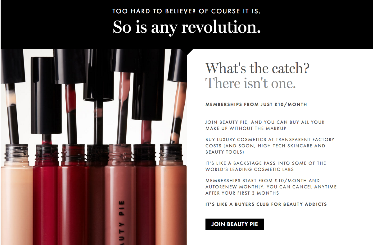
When it comes time to write the web copy for your new site, it can feel more than a little overwhelming. Staring at a blank screen, trying to decide what to say, how to say it and in what order — it’s enough to send anyone running (or at least, running for our Articulation Intensive).
There are a lot of things to keep in mind while trying to craft clever and compelling web copy and we’ll continue to offer advice on this blog. But for now, we’ve put together six common mistakes start-ups and entrepreneurs make when drafting the wording for their sites.
1. Using generic language
Is your product "innovative and unique"? Great, so is everyone else’s. Using generic or jargon-y terms to describe your product or service won’t do you any favors. It won’t help you stand out from your competitors and won’t get potential customers excited about your brand.
Instead, think of the truly unique aspects of your brand and use that language to describe it. And once you’ve drafted a version of your web copy, go through and highlight any words that seem generic or off-brand. Take some time to consider alternatives that speak more authentically to who you are and help differentiate you from the crowd. The thesaurus is your friend here, since it can help you find words with similar meaning to those generic terms but that speak much more strongly to your brand experience.
2. Not including your "why"
Talking about the products or services you provide is fantastic, but it can also be hugely helpful to explain why you launched the brand you did. What makes you so passionate about this industry? What are you hoping to accomplish? What struggles got you to this point?
All of these "whys" help paint a clearer picture of your brand and let customers feel like they know you. If they can relate to your passion or struggles it creates a connection, which in turn makes them more engaged clients and brand evangelists.
3. Making it all about you
That said, while you definitely want to include information about yourself and why you created the company you did, your website copy shouldn’t be all about you and what you do. You also want to address why your customers should care about the product or service you provide.
What’s in it for them? What benefits (whether financial, emotional, physical, etc.) will they receive from buying from you? Make this as clear as possible so customers can feel confident in their purchases.

4. Trying to be all things to all people
We get it, you want as many people as possible to buy your product or service. But trying to appeal to a wide, general audience is generally a recipe for disaster. It forces you to water down your language (and remember, we don’t want generic) or bounce around from idea to idea, trying to cover all your bases. Neither tactic gives audiences a clear vision of what you can offer them. There’s a saying: "In trying to appeal to everyone, you appeal to no one." Keep it in mind and focus on writing web copy specific to your target audience only.
5. Word vomiting on your homepage
It is important to let people know what you’re all about, why they should buy from you, etc. But loading up your homepage with massive blocks of text will only scare people away. Think of your homepage like a trailer for a movie. You don’t want to give away all the good stuff, but you do want to entice people enough to keep scrolling or clicking.
A smart tagline that clearly conveys your brand, a short paragraph or bullet point list that explains what you’re about and clear instructions on how to learn more is a great starting point for the top of your homepage. And if you do want to include more text, just be sure to break things up visually with photos, bullet points, icons and more to keep readers’ eyes moving down the page instead of glazing over.
6. Keeping things too vague
On the flip side, if your homepage or website in general doesn’t clearly convey what you’re offering and why people should buy from you, then you need to keep working.
Some start-ups merely give a brief overview or show a flashy-but-unclear video and then ask potential customers to contact them for more information. And while this might work with some people, most will simply move on to another website that doesn’t make them work for information.
Remember that there are an endless amount of sites out there and you have competition no matter what industry you’re in. So make your site quick and easy to read, and make sure you web copy clearly conveys who you are, what you do and why they should care. Doing so helps ensure that your customers stay on your site and don’t head elsewhere out of frustration or boredom.


