 I am obsessed with Being Boss. Hosted by branding expert Kathleen Shannon, and web developer Emily Thompson, it is a weekly podcast devoted to helping creative entrepreneurs be boss and "do the work."
Yesterday I listened to last week's installment, which featured a lengthy interview with Emily's sales coach Kendrick Shope. Kendrick helped Emily move from selling projects in the $8,000 range to selling multiple projects in the $20,000+ range. Who wouldn't perk up at the sound of those numbers?
In the episode, Kendrick touches on the importance of proper branding to the sales process. The part of the interview that struck me the most comes at about minute 33:
"Every line of [website] copy has one job. It is not to get a close. It is not to get a sale. Every line of copy has one job: to get someone to read the next line."
YES.
Your website is one of your most important sales tools. The longer visitors linger on your site, and the more they read, the more likely they are to eventually do business with you.
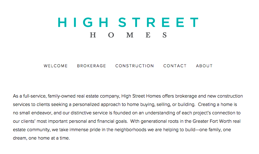
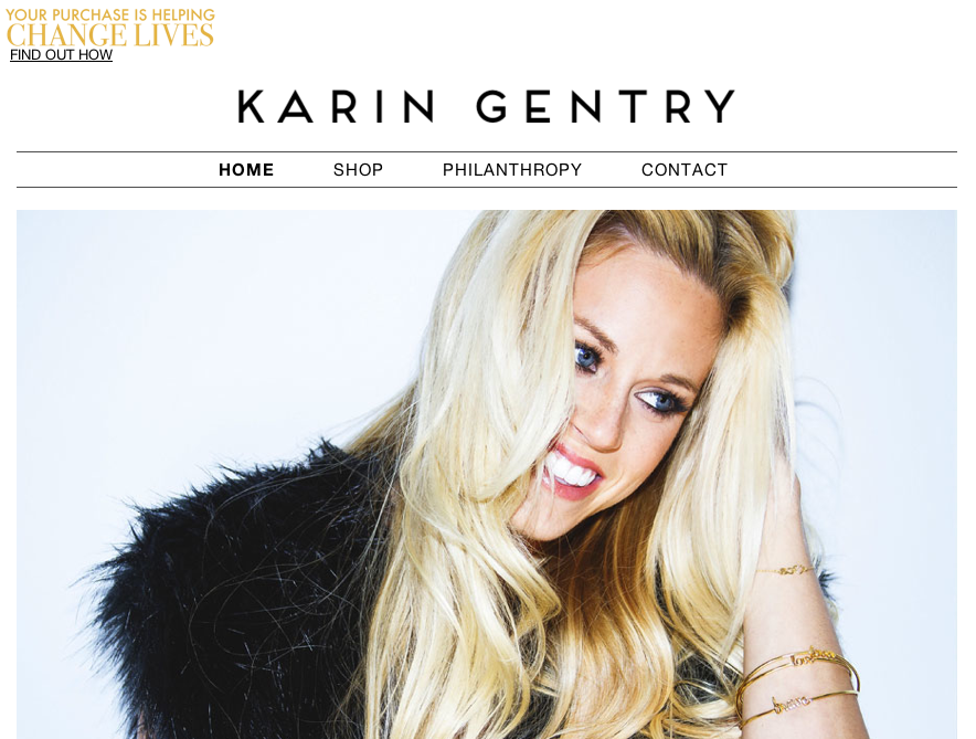
Far too often I see websites that have brilliant design, great photography, and professional branding but fail to keep me engaged due to lackluster copy.
In the spirit of Kendrick's advice, I thought it would be helpful to share 5 simple keys for writing website copy that sells (by getting them to read the next line).

1. Dot your I's and cross your T's.
The first step to writing website copy that sells is simple: dot your I's and cross your T's. Silly typos and punctuation errors send the wrong message about your attention to detail and professionalism. This applies to everyone but is especially true for those of us in the professional services sector.
To create buttoned-up copy that sells, don't rely on your word processor or CMS's spell check. Instead, consider adopting a rule of two - at least two people read and edit every piece of brand communication that you create.
When it comes to grammar, be correct, unless you have a great stylistic reason for not being. In the latter instance, make sure it is very obvious that you are taking creative license with the language.
These are easy fixes that make an immediately positive impression with your site visitors.
2. Develop a unique voice.
Admittedly, developing a unique brand voice and writing style doesn't happen overnight. It is an iterative process that takes time, but you have to start somewhere. Here are some tips to get you going:
- Read your copy out loud (preferably not just to yourself)
This one is so obvious that it is often missed. Start the editing process by reading your content out loud.
Once you do, ask yourself these questions:
"Does this sound like it is coming from a person working at this organization?"
"Does this sound like me?"
"Did my tongue trip over certain sentences?"
"Would I feel comfortable reading this out loud to one of my clients?"
The answers to these questions will reveal the next steps you should take in the editing process.
- Ditch "corporate" and embrace "professional."
This was another great tip from the podcast. Although big businesses are catching on to the importance of humanizing their writing, traditionally corporate websites abound with lengthy sentences, jargon, and clichés ("paradigm shifts," "silos," "move the needle," etc.) that bury the uniqueness of the organization's culture.
To write website copy that sells, try embracing a professional tone of voice that lets your authentic personality shine.
Humor, wit, vulnerability, and sincerity are not mutually exclusive to professional.
- Be punchy.
Does your copy seem to drag on when you read it out loud?
When this happens in my own writing it is usually due to unnecessarily lengthy sentences. Shortening sentences instantly makes your copy more powerful and bright.
My general rule of thumb is this: unless a sentence includes a list, it should have no more than one comma or semicolon in it.
If you notice that your sentences use a lot of conjunctions, break them down to shorter sentences. To pack even more personality into your writing, experiment with two or three word sentences. Fun, right?
- Get active.
The dreaded passive voice slows the pace of your writing and makes website copy sound needlessly corporate (see point 2).
Example:
"This report has been published by Stark & Splendor to illuminate the importance of grammar."
vs.
"Stark & Splendor published this report to illuminate the importance of grammar."
See the difference? The first sentence sounds distant and robotic and the second sentence sounds personable and human. People buy from humans not robots, so sound human and avoid using the passive voice. Here's a more technical description of the passive vs. active voice in case you are curious.
3. Mind your headlines.
In the podcast, Kendrick talks about her easy litmus test for a great email subject line?
Would I open that if Scandal were on TV?
Insert your favorite TV show, and this becomes a great test for you to apply to your headline and subject line writing.
Most visitors to your site will not read every word on every page. In our time-poor age, they have come to your website for a particular reason. Don't agitate your visitors by making it difficult for them to find what they are looking for. Instead, use clear or catchy [or both] headlines as signposts to point your website visitors in the right direction. Once they have found what they need, they will be in the right mood to read the rest of the great content that you have for them.
For each section, don't settle on the first headline that pops into your head. Instead, write down a list of a few different options and experiment with mixing and matching them or pairing them as headline and subhead combos.
4. Tell a story.
Website copy that sells tells a story. Why? Because people buy from people, and nothing humanizes your organization quite like narrative.
Stories have an incredible ability to convey values. Your values are what will make people trust, like, relate to, and, ultimately, buy from you.
To harness the power of narrative for your website, think about specific sections that would be enriched by interjecting a personal anecdote or metaphor. Perhaps it is an origin story on the homepage, or a quirky metaphor to explain how you help your customers on the product pages.
At the very least, make sure that your blog and social media content overflows with stories. These will make you a dynamic, human brand that website visitors will want to buy from.
5. Make the "whys" obvious.
In the podcast Kendrick shares the mantra that she drills into her coaching clients' minds - "why does it matter?" The phrase helps them focus their sales conversations around the ultimate benefit of what they are selling.
In my own practice, I employ a similar adage. I call it "knowing your why." In short, know why you are selling what you are selling - its ultimate purpose -, because people don't buy products, they buy purpose.
Just as importantly, you have to know your customers' "whys" too. They have come to your site with specific problems that they are trying to solve. What answers are they seeking? What assurance do they need? Why does solving their pain point matter?
Some problems will be highly practical and tangible. Others will be of an emotional or psychological nature. Either way, make sure you are speaking to their "whys."
The bottom line:
Website copy that sells doesn't push to close the deal right away. Great copy keeps visitors reading by taking them through a thoughtfully planned journey. This leaves them feeling like they engaged with a sincere and dynamic person who just happens to sell a solution they could use. This is how you nurture sales, get repeat visitors, and build communities of trust around your brand.


